Section

Organize elements into collapsible sections in WindUI

Section

Section Element

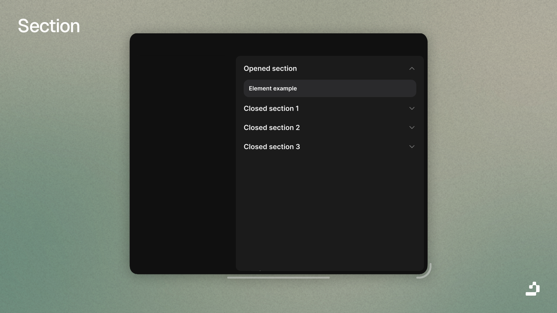
Sections organize related elements into collapsible groups. They're useful for grouping related settings or features.

local Section = Tab:Section({
    Title = "General Settings"
})
 
Section:Button({ Title = "Button in Section" })
Section:Toggle({ Title = "Toggle in Section" })

Section Parameters

NameDefault
: stringSection
: string?nil
: string?nil
: Color3?nil
: number?19
: string?Left
: boolean?false
: boolean?false
: boolean?true
: Enum.FontWeight?SemiBold
: Enum.FontWeight?Medium
: number?0.05
: number?0.4

Section Function

Name
()
()
()
()
()

Section Variants

Simple Section

local BasicSection = Tab:Section({
    Title = "Basic Options"
})
 
BasicSection:Button({ Title = "Option 1" })
BasicSection:Button({ Title = "Option 2" })
BasicSection:Button({ Title = "Option 3" })

Section with Icon

local DisplaySection = Tab:Section({
    Title = "Display",
    Icon = "monitor",
    Opened = true
})
 
DisplaySection:Toggle({ Title = "Dark Mode" })
DisplaySection:Slider({ 
    Title = "Brightness",
    Value = { Min = 0, Max = 100, Default = 80 }
})

Section with Description

local AdvancedSection = Tab:Section({
    Title = "Advanced Settings",
    Desc = "Configure expert-level options",
    Icon = "zap",
    Opened = false
})
 
AdvancedSection:Toggle({ Title = "Enable Debug Mode" })
AdvancedSection:Input({ Title = "API Key" })

Boxed Section

local BoxedSection = Tab:Section({
    Title = "Important Settings",
    Box = true,
    BoxBorder = true,
    Icon = "alert-circle",
    Opened = true
})
 
BoxedSection:Toggle({ Title = "Require Confirmation" })
BoxedSection:Button({ Title = "Apply Changes" })

Closed Section

local CollapsedSection = Tab:Section({
    Title = "Advanced Options",
    Icon = "settings",
    Opened = false,
    TextSize = 16
})
 
CollapsedSection:Button({ Title = "Advanced Setting 1" })
CollapsedSection:Button({ Title = "Advanced Setting 2" })

Centered Section

local CenteredSection = Tab:Section({
    Title = "Features",
    TextXAlignment = "Center",
    TextSize = 20
})
 
CenteredSection:Button({ Title = "Feature A" })
CenteredSection:Button({ Title = "Feature B" })
  • Tab - Tab container
  • Elements - Available elements to add to sections
  • Window - Create sections in window